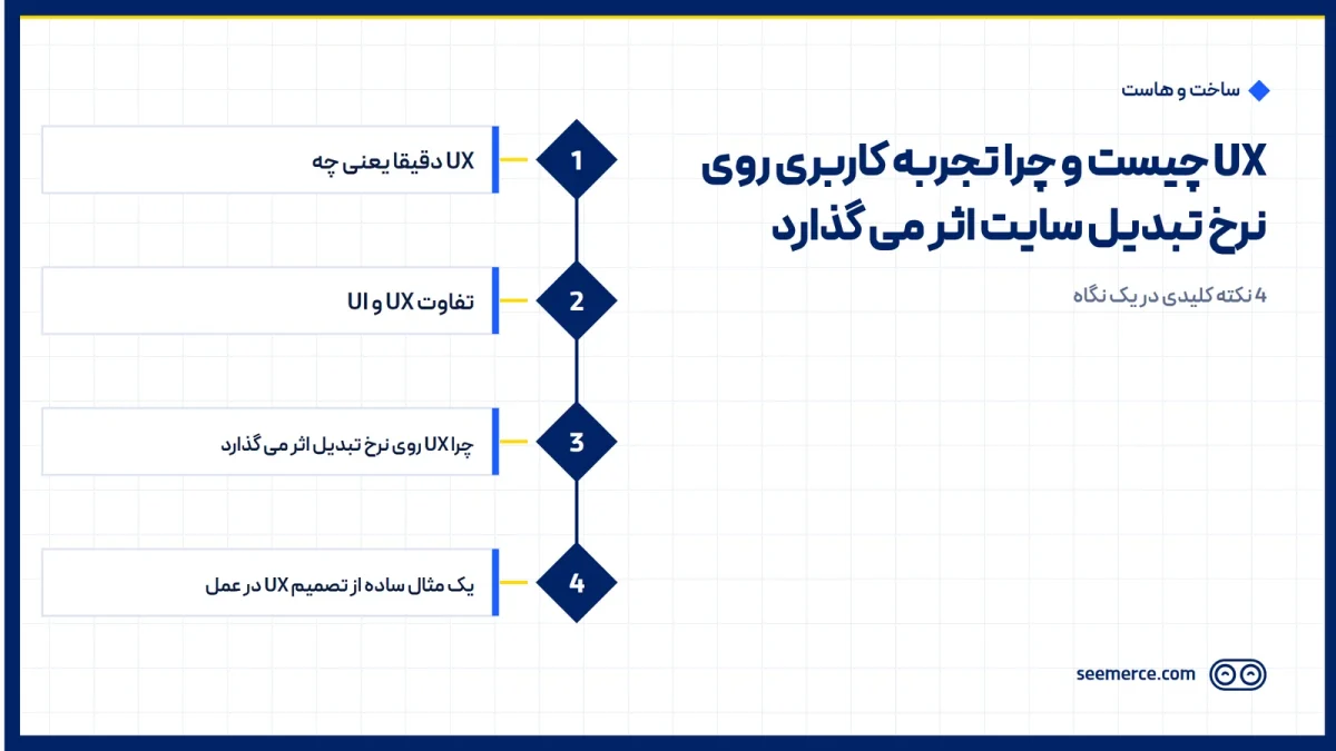
UX, or User Experience, is about how easily a visitor reaches what they came for once they land on your site. UX is often mistaken for how pretty a site looks, but a site can be visually polished and still have poor user experience. In good web design, UX is one of the foundations that directly affects business results.
What UX actually means
UX covers everything that happens between a user landing on the site and reaching their goal: finding information, filling out a form, adding a product to the cart, or finding a phone number. If any of these steps is unclear, slow, or confusing, even the best visual design won't stop the user from leaving before reaching their goal.
UX vs. UI
UI (user interface) is the visible part of the site: colors, fonts, buttons, icons. UX is broader and also covers the logic behind those elements: is the button placed somewhere logical, is the purchase path as short as it can be, is the error message on a form clear. A site can have a beautiful UI and weak UX; a good example is a site that looks attractive but takes several minutes to find the contact button.
Why UX affects conversion rate
Conversion rate is the share of visitors who reach the intended goal (a purchase, a call, a submitted form). Every small obstacle in the user's path chips away at that share: a form that's longer than it needs to be, a button whose color barely stands out from the background, or an extra step in the checkout process. It's the sum of these small obstacles that creates the gap between a site with a high conversion rate and an otherwise similar site with a low one.
A few practical UX decisions
- Trimming the contact form down to the fewest necessary fields, instead of asking for unnecessary information.
- Showing the phone number or main call-to-action near the top of the page, without needing a long scroll.
- Clear error messages on forms (e.g. "phone number must be 11 digits") instead of a generic "an error occurred."
- Showing remaining steps during checkout, so the user knows how much is left.
A simple example of a UX decision in practice
Say a service company has a consultation-request form that requires filling in 12 fields: name, phone, email, city, service type, rough budget, how they heard about the company, and a few more. Most of this information isn't needed for a first call and can be asked during that same phone call. Trimming the form down to three or four essential fields (name, phone, service type) means users who used to give up partway through a long form now finish it. This kind of change is neither expensive nor time-consuming, but it can directly affect the number of inbound calls.
UX and marketing: two teams that need to be aligned
Marketing teams often focus on bringing in more traffic while the site itself is what's blocking that traffic from converting into customers; the result is rising ad spend without a matching rise in sales. That's why reviewing a site's UX should sit alongside digital marketing planning, not separately from it; driving more traffic to a broken path only goes so far.
UX on mobile, where mistakes show up more
The same UX decisions that look minor on desktop become bigger on mobile, since both screen space and user patience are more limited there. A button that's easy to click with a mouse on desktop might be small enough on mobile to cause repeated mis-taps; a form that's long but tolerable on desktop feels more exhausting once the on-screen keyboard is open on mobile. That's why no site's UX review is complete without serious testing on mobile, since a large part of the user's final decision, to call or to abandon the site, gets made right there.
Cognitive load, a concept that gets mentioned less
One of the foundational ideas in UX is "cognitive load": how much thinking a user has to do to understand each page. A page with ten options presented at once carries more cognitive load than a page that offers a clear path and one main action. The higher the cognitive load, the more likely a user is to get tired and leave the site without ever really engaging with the main goal. Reducing cognitive load, by removing unnecessary options and highlighting one main action per page, is one of the simplest ways to improve UX.
Trust, the hidden part of UX
A part of UX that gets less attention is building trust: is real, verifiable contact information shown, are genuine reviews or past work visible, does the site build initial confidence with an SSL certificate and a professional look. A user who doesn't trust a site won't fill out a form no matter how well the buttons are arranged; part of UX is exactly this initial sense of confidence, not just ease of clicking.
UX and a user's first impression
The first few seconds on a site shape a large part of the user's judgment: does the page load quickly, is it clear whose business this is and what can be done here. If those first few seconds are met with a cluttered page, a large irrelevant banner, or a confusing menu, some users leave before ever reaching the actual content. Good design tries to answer these two simple questions clearly within those first few seconds.
How to tell if a site's UX has a problem
One of the simplest methods is looking at the site's analytics: pages users leave quickly, or forms that get started but never submitted. Another is asking a few people outside the team to complete a short task on the site (say, finding the price of a service) and watching where they get stuck.
UX in a new design vs. improving an existing site
When UX is considered from the initial design stage, its cost usually fits inside the design project itself and needs less separate work later. The problem shows up more on sites that have grown for years without dedicated attention to user experience: every time a new section or a new form got added, it wasn't necessarily aligned with the rest of the site. The result is a site where each individual page might be acceptable, but the overall user path is scattered and inconsistent. Improving a site like that usually needs a targeted review that re-examines the main user paths, not necessarily every single page.
What this doesn't cover
We don't claim that improving UX alone multiplies conversion rate; price, brand credibility, and the actual quality of the service matter too. Good UX also isn't built once and left alone; as user behavior shifts and new content gets added, it needs to be revisited.
Frequently asked questions
Does UX only matter for online stores?
No; company and service sites need UX just as much, since their goal is also getting the user to a specific action like calling or submitting a form.
Is color and graphic design part of UX?
It's part of UI, which in turn affects UX; for example, low color contrast can make text or buttons hard to find.
How do I know if I need a full redesign for UX or just a small fix?
If the problem is in a few specific spots (say, one form), a small fix is enough; if the entire user path is confusing, a broader review is needed.
Does improving UX also affect SEO?
To some extent, yes; time spent on the site and a quick bounce rate are among the signals Google also pays attention to.


Comments and questions
No comments yet. If you have a question, we'd be glad to hear it.
Write a comment